
Harnessing the Power of Data Visualization with Power BI
Learn how to create stunning graphs and visualizations using Power BI to unlock insights from your data.
Harnessing the Power of Data Visualization with Power BI
In today’s data-driven world, the ability to effectively communicate insights through visualizations is paramount for data analysts and professionals. One tool that has gained significant popularity for its robust data visualization capabilities is Microsoft Power BI. Whether you’re a seasoned data analyst or just starting your journey into the world of data visualization, this tutorial will guide you through the process of creating compelling graphs and visualizations using Power BI.
Introduction to Power BI
Power BI is a powerful business analytics tool developed by Microsoft that allows users to visualize and share insights from their data. With its intuitive interface and wide range of visualization options, Power BI enables users to transform raw data into interactive and visually appealing reports and dashboards.
Why Power BI?
When it comes to data visualization, Power BI offers several advantages over other tools such as Excel, R, or Python:
-
User-Friendly Interface: Power BI’s intuitive drag-and-drop interface makes it easy for users of all skill levels to create stunning visualizations without the need for extensive programming knowledge.
-
Wide Range of Visualization Options: Power BI provides a comprehensive library of visualization types, including bar charts, line graphs, pie charts, scatter plots, and more, allowing users to choose the most suitable visualization for their data.
-
Seamless Integration with Microsoft Ecosystem: Power BI seamlessly integrates with other Microsoft products and services, such as Excel, Azure, and Dynamics 365, making it easy to import data from various sources and share insights across the organization.
-
Real-Time Data Analysis: With Power BI, users can perform real-time data analysis and create live dashboards that update automatically as new data becomes available, enabling timely decision-making and actionable insights.
-
Scalability and Performance: Power BI is designed to handle large datasets and complex analytical queries with ease, ensuring optimal performance and scalability for organizations of all sizes.
Getting Started
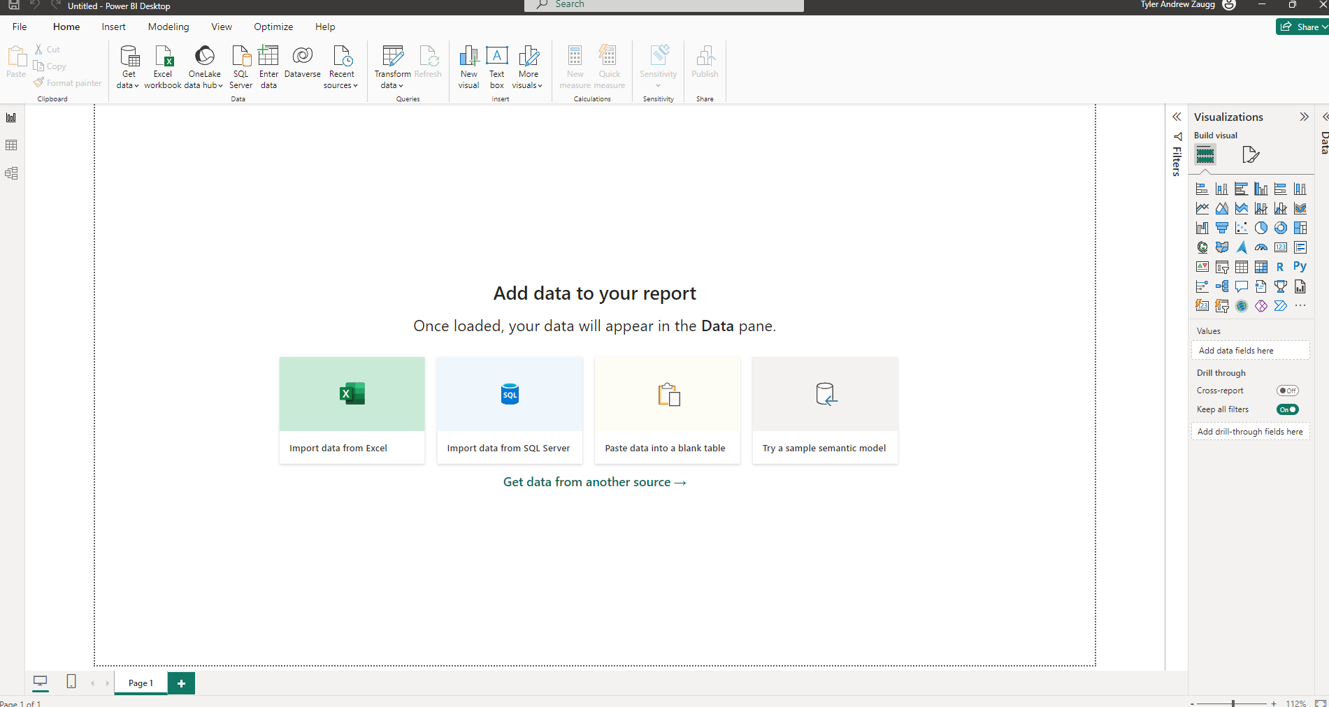
Before diving into creating visualizations, you’ll need to have Power BI Desktop installed on your computer. You can download and install Power BI Desktop for free from the official Microsoft website.
Once you have Power BI Desktop installed, launch the application and follow the prompts to sign in or create a new account. You’ll then be greeted with a blank canvas where you can begin importing and visualizing your data.
Creating Graphs and Visualizations
1. Importing Data
To create a graph or visualization in Power BI, you’ll first need to import your data into the application. Power BI supports a wide range of data sources, including Excel spreadsheets, SQL databases, and cloud-based services such as Azure and Google Analytics.
To import data, click on the “Get Data” button in the toolbar and select your desired data source. Follow the prompts to connect to your data source and import the relevant datasets into Power BI.
2. Choosing the Right Visualization
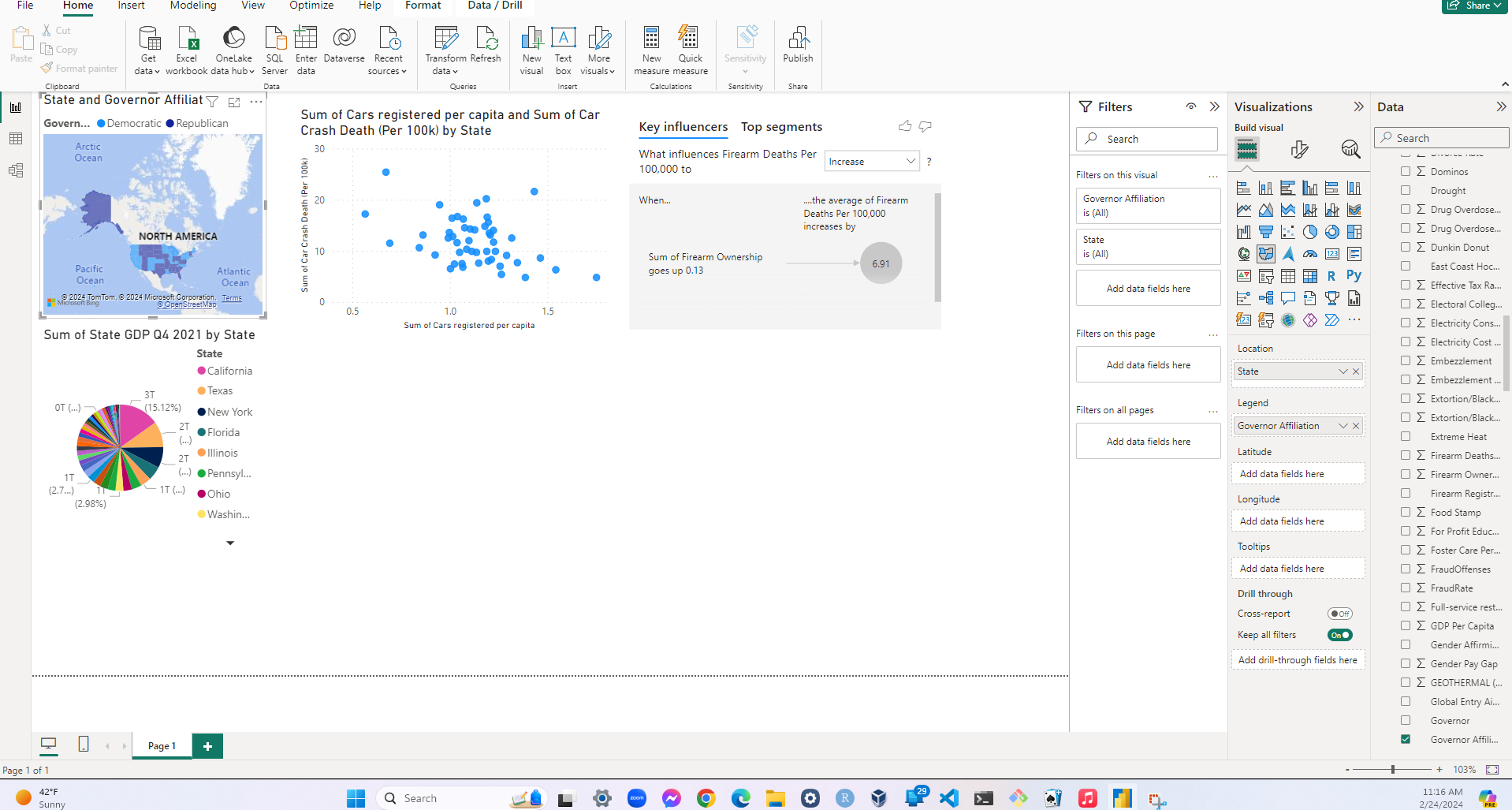
Once your data is imported, it’s time to choose the right visualization to represent your data effectively. Power BI offers a plethora of visualization options, including bar charts, line graphs, pie charts, scatter plots, and more.
To create a new visualization, simply drag and drop the fields from your dataset onto the canvas and choose the appropriate visualization type from the visualization pane. Power BI will automatically generate a visualization based on your selected fields, which you can then customize further to suit your needs.
3. Customizing Visualizations
Power BI provides a wide range of customization options to help you tailor your visualizations to your specific requirements. You can customize everything from colors and fonts to axis labels and data labels, allowing you to create visually stunning and informative graphs and charts.
To customize a visualization, simply select the visualization on the canvas and use the formatting options in the visualization pane to make your desired changes. You can also use the formatting tools to add additional elements to your visualizations, such as trend lines, annotations, and reference lines.
Conclusion
In conclusion, Power BI is a powerful tool for creating stunning graphs and visualizations that enable users to unlock insights from their data. Whether you’re analyzing sales data, tracking key performance indicators, or visualizing survey results, Power BI provides all the tools you need to create informative and visually appealing reports and dashboards.
So why wait? Download Power BI Desktop today and start harnessing the power of data visualization to drive better decision-making and business outcomes.